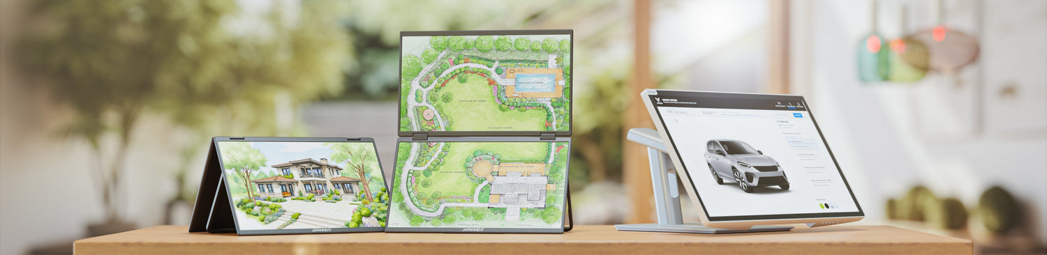
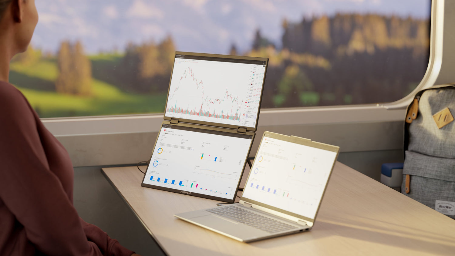
Two laptops displayed in Full HD do not show text with the same sharpness. On a 13.3-inch panel, the 1920 x 1080 pixels are spread over a short diagonal, resulting in 166 pixels per inch. On a 17.3-inch panel, the same 1920 x 1080 pixels are spread over a larger surface, dropping to 127 pixels per inch. The resolution is identical, but the fineness is not.
The ratio between the diagonal and the number of pixels determines readability, not the diagonal alone or the resolution alone. Enlarging the screen without increasing the resolution does not provide a better image; it provides a larger image. This article provides the numerical benchmarks to decide, then discusses other criteria for a mobile monitor in the order they arise: size, resolution, panel type, connectivity, responsiveness, and ergonomics.
Screen Size: Find the Right Balance
The first criterion to consider is the size of the panel. Laptop screens are generally available between 11 and 17 inches. For mobile use and office work, a 13 to 14-inch diagonal is sufficient. For graphic design, video editing, gaming, or movie watching, a 15 to 17-inch diagonal offers more workspace.
One inch is exactly 2.54 centimeters. The diagonal announced by the manufacturer is that of the display panel, measured from corner to corner, and not that of the chassis: a 15.6-inch chassis is always wider and taller than the panel it holds.
Announced diagonal: 11 inches
Panel diagonal in centimeters: 27.9 cm
Announced diagonal: 13 inches
Panel diagonal in centimeters: 33.0 cm
Announced diagonal: 13.3 inches
Panel diagonal in centimeters: 33.8 cm
Announced diagonal: 14 inches
Panel diagonal in centimeters: 35.6 cm
Announced diagonal: 15 inches
Panel diagonal in centimeters: 38.1 cm
Announced diagonal: 15.6 inches
Panel diagonal in centimeters: 39.6 cm
Announced diagonal: 16 inches
Panel diagonal in centimeters: 40.6 cm
Announced diagonal: 17 inches
Panel diagonal in centimeters: 43.2 cm
Announced diagonal: 17.3 inches
Panel diagonal in centimeters: 43.9 cm
These values are direct conversions, obtained by multiplying the diagonal in inches by 2.54. Beyond 20 inches, we leave the realm of portable devices for that of desktop monitors, where the trade-off in size no longer applies in the same terms: see which size to choose beyond 20 inches.
What Full HD, WUXGA, QHD, WQXGA, and 4K Mean
Resolution acronyms indicate a number of pixels in width and height, nothing more. They do not specify the screen size or panel quality. Here are the resolutions found on mobile monitors and accompanying monitors.
Acronym: HD
Resolution in pixels: 1366 x 768
Aspect ratio: 16:9
Acronym: Full HD, also noted 1080p
Resolution in pixels: 1920 x 1080
Aspect ratio: 16:9
Acronym: WUXGA
Resolution in pixels: 1920 x 1200
Aspect ratio: 16:10
Acronym: QHD, also noted WQHD or 1440p
Resolution in pixels: 2560 x 1440
Aspect ratio: 16:9
Acronym: WQXGA
Resolution in pixels: 2560 x 1600
Aspect ratio: 16:10
Acronym: 3.2K
Resolution in pixels: 3200 x 2000
Aspect ratio: 16:10
Acronym: 4K UHD
Resolution in pixels: 3840 x 2160
Aspect ratio: 16:9
Two families stand out. 16:9 resolutions fill a widescreen monitor, suitable for video. 16:10 resolutions, recognizable by the initial W in the WUXGA and WQXGA acronyms, add height: 120 additional pixel lines between Full HD and WUXGA, 160 between QHD and WQXGA. On a document, spreadsheet, or code, this height is immediately noticeable as it translates to more visible text lines without scrolling.
The term 1080p refers to the same resolution as Full HD. The "p" signifies that the image is progressive, meaning all lines are displayed with each refresh. The notation 1080i, now rare, indicates an interlaced display, where every other image contains only half the lines.
Resolution: A Key Factor for a Sharp Image
Resolution alone is not enough to judge sharpness. What matters is display density, i.e., the number of pixels per inch of diagonal. It is calculated by dividing the diagonal in pixels by the diagonal in inches, with the diagonal in pixels being the square root of the sum of the squares of the width and height.
The Same Resolution Does Not Guarantee the Same Fineness
Diagonal: 13.3 inches
Resolution: 1920 x 1080, Full HD
Density, in pixels per inch: 166
Diagonal: 13.3 inches
Resolution: 1920 x 1200, WUXGA
Density, in pixels per inch: 170
Diagonal: 14 inches
Resolution: 1920 x 1080, Full HD
Density, in pixels per inch: 157
Diagonal: 15.6 inches
Resolution: 1920 x 1080, Full HD
Density, in pixels per inch: 141
Diagonal: 15.6 inches
Resolution: 3840 x 2160, 4K UHD
Density, in pixels per inch: 282
Diagonal: 16 inches
Resolution: 2560 x 1600, WQXGA
Density, in pixels per inch: 189
Diagonal: 17.3 inches
Resolution: 1920 x 1080, Full HD
Density, in pixels per inch: 127
Diagonal: 17.3 inches
Resolution: 2560 x 1440, QHD
Density, in pixels per inch: 170
Reading these lines boils down to one sentence: in Full HD, density drops from 166 to 127 pixels per inch when the diagonal increases from 13.3 to 17.3 inches. The large screen displays the exact same number of pixels, but each occupies a larger surface, affecting text outlines.
The practical consequence is simple. A 17-inch screen benefits from upgrading to QHD, where it regains 170 pixels per inch, the same density as a 13.3-inch WUXGA screen. Conversely, a 13.3-inch Full HD screen doesn't need 4K to display readable text. Two formats in the catalog illustrate this division: the 13.3-inch IPS WUXGA HDR Portable Screen works on a short diagonal with a resolution of 1920 x 1200, while the 23.8-inch IPS 4K UHD HDR Portable Screen compensates its diagonal with a four-fold higher resolution.
Choose Your Resolution According to Usage
- For general tasks, browsing, and writing: Full HD is sufficient up to 15.6 inches.
- For working with long documents, spreadsheets, and code: WUXGA or WQXGA, whose additional height reduces scrolling.
- For photo editing, video editing, and graphic design: QHD from 15 inches, 4K UHD beyond.
There is no universal threshold for when the eye stops distinguishing pixels; the result depends on the reading distance, which varies from one workstation to another. Therefore, the ratio between diagonal and resolution remains the only reliable benchmark.
Panel Type: Available Technologies
Three panel technologies equip the vast majority of screens.
- IPS (In-Plane Switching): Faithful colors and wide viewing angles, up to 178 degrees. This technology is chosen for image work and professional office use.
- VA (Vertical Alignment): High contrast and deep blacks, suitable for viewing multimedia content.
- TN (Twisted Nematic): Short response time and controlled cost, at the expense of narrower viewing angles and less accurate color rendering.
On a laptop screen, the viewing angle matters more than elsewhere: the panel is rarely perpendicular to the gaze, as its inclination depends on the lid's opening. An IPS panel forgives this deviation, while a TN panel makes you pay for it with color shifts. All portable monitors in the catalog use IPS panels.
Connectivity and Compatibility: Don't Neglect This Aspect
Choosing a screen requires verifying the correspondence between its connectors and those of the computer. Common connectors include:
- HDMI, present on almost all machines and screens;
- DisplayPort, common on desktops and workstations;
- USB-C, which carries the video signal thanks to DisplayPort alternate mode;
- VGA and DVI, inherited from previous generations;
- Thunderbolt, found particularly on MacBooks.
USB-C deserves special attention because a single cable can carry three distinct things: video, data, and power. This last function falls under the USB Power Delivery specification, published by the USB Implementers Forum. A screen that implements it charges the computer while displaying it, eliminating a power adapter from the desk. The power delivered is indicated in watts on the technical sheet and should be compared to what the machine requires. The details of this operation are covered in the article on charging via USB-C Power Delivery.
Responsiveness: An Important Criterion for Some
Response time measures how long a pixel takes to change color. It is expressed in milliseconds. A short time limits motion blur on fast-moving images.
- For gaming and demanding professional uses: a response time of 1 to 5 ms.
- For office work and everyday tasks: 10 ms or more is suitable.
The refresh rate, expressed in hertz, indicates how many times per second the image is renewed. It is not to be confused with response time: the former describes a rate, the latter a transition speed. On an office workstation, comfort improves up to a certain point, after which the gain becomes marginal.
Design and Ergonomics: A Significant Aspect
Dimensions, weight, and material quality are factors in the choice, especially for a machine transported daily. A secondary screen placed next to the laptop raises another question: its stand. Models adjustable in height, tilt, and rotation allow the panel to be aligned with the gaze rather than forcing the user to bend their neck. This topic is covered in the article dedicated to choosing a desktop monitor.
The Second Screen to Take With You
A laptop's integrated display cannot be replaced, but it can be supplemented. A portable monitor connects via USB-C, fits into the computer's sleeve, and doubles the workspace without taking up desk space. It does not replace the machine's screen; it adds to it.
Several formats meet different uses, and all are in the catalog as of the writing of this article:
- 13.3-inch IPS WUXGA HDR Mobile monitor, for 16:10 resolution on the shortest diagonal;
- 15.6-inch IPS Full HD Mobile monitor, in the format closest to a standard laptop;
- 15.6-inch IPS Full HD Touch Mobile monitor, when direct on-screen annotation is useful;
- 23.8-inch IPS Full HD HDR Mobile monitor and its 4K UHD version, for a true workspace at home;
- Dual 15.6-inch IPS Full HD Mobile monitor, to recreate a two-display workstation on the go.
The relationship between diagonal and resolution applies to these models as much as to integrated panels. A 23.8-inch Full HD screen offers surface area, while a 23.8-inch 4K UHD screen offers both surface area and fineness.
To Go Further
- What size to choose beyond 20 inches, for balancing large diagonals.
- What 5K adds to 4K, when display density becomes the main criterion.
- Charging via USB-C Power Delivery, for single cable operation.
- Choosing a desktop monitor, for fixed workstations.
Frequently Asked Questions
What screen size should I choose for a laptop?
13 to 14 inches for mobile use and office work, 15 to 17 inches for graphic design, editing, and gaming. The diagonal is chosen with the resolution, not alone: a 17-inch Full HD screen displays text less finely than a 14-inch Full HD screen.
How many centimeters are 15.6 inches?
39.6 centimeters diagonally, since one inch is exactly 2.54 centimeters. This measurement refers to the display panel, not the chassis, which is always larger.
What resolution for a laptop screen?
Full HD, or 1920 x 1080 pixels, is suitable up to 15.6 inches for everyday tasks. Beyond 15 inches, QHD at 2560 x 1440 restores the fineness lost by the panel's enlargement. WUXGA at 1920 x 1200 adds useful height for documents and code.
What's the difference between Full HD and WUXGA?
The width is identical, 1920 pixels in both cases. WUXGA adds 120 lines in height, with 1200 pixels versus 1080, resulting in a 16:10 aspect ratio instead of 16:9. On a 13.3-inch diagonal, this increases the density from 166 to 170 pixels per inch.
Does a large screen display a sharper image?
No, not at the same resolution. A 17.3-inch Full HD screen drops to 127 pixels per inch, compared to 166 for a 13.3-inch screen with the same resolution. A larger screen displays a larger image, and sharpness only improves if the resolution also improves.